Five Below OmniChannel Unlock — hero overview mockups

Five Below OmniChannel Unlock

Bridging the app and the aisle, so buying online feels as certain as holding the thing.

Overview

Five Below needed its fast-growing e-commerce experience to connect with the physical in-store reality. Over six months we redesigned the core OmniChannel surfaces, guided by store data, user testing, and an icon system built to last.

Role

Lead Product Designer

Team

Design Lead · Art Directors · Engineers · Analytics

Tools & Timeline

Figma · Sketch · Analytics — 6 months

01 — Context

Customers browsed online but bought in person — and we made them leap the gap blind

In early 2021, cart abandonment was high, BOPIS adoption was lagging, and the mobile experience carried years of design debt across inconsistent UI generations. The moment of highest intent — “is it really on the shelf?” — was exactly where the product went quiet.
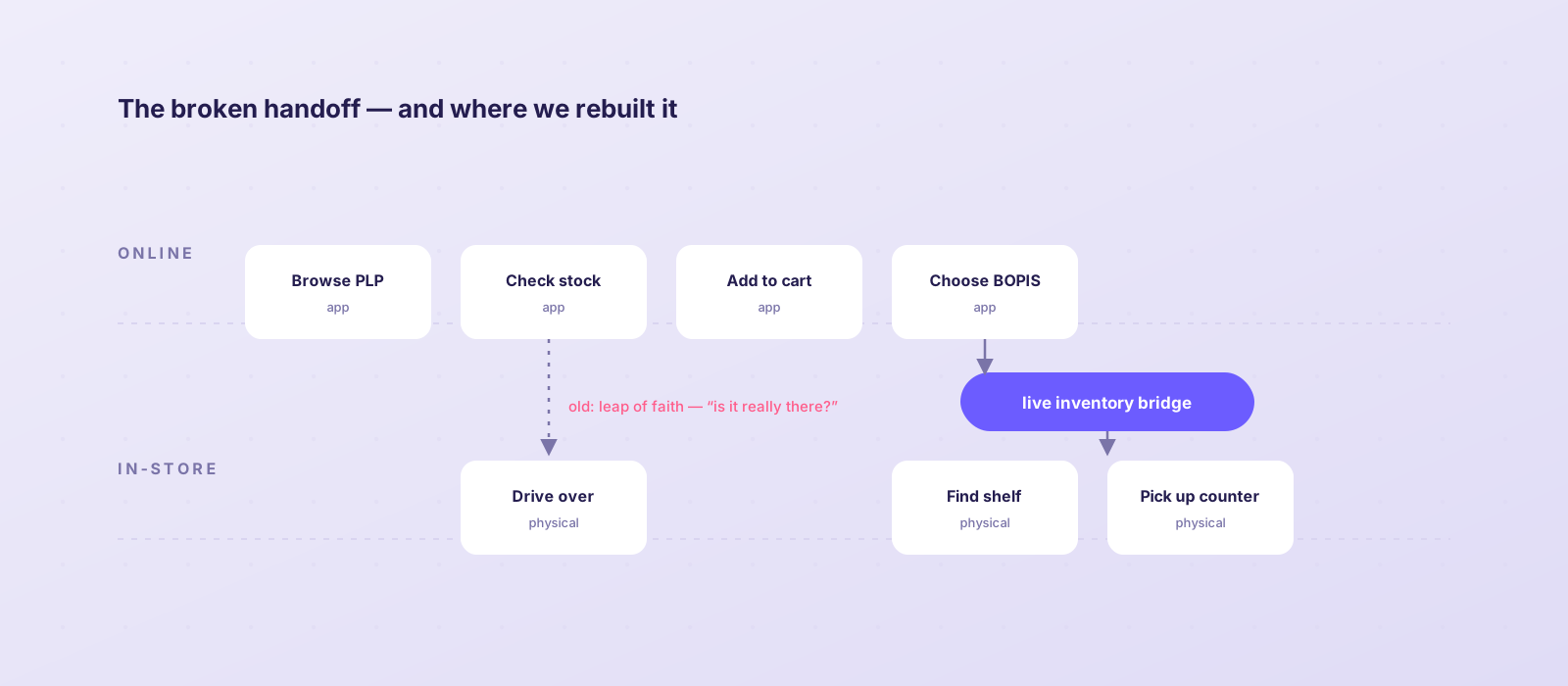
OmniChannel journey map, online to in-store
The journey map exposed the leap of faith between browsing online and standing in an aisle. We rebuilt the bridge with live inventory at every decision point.
Target: −6.8% cart abandonmentTarget: +10% BOPIS revenueSame-day app-to-shelf accuracy
02 — The challenge

How might we make the digital-to-physical handoff feel effortless at the exact moment a customer is ready to act?

03 — The solution

Five surfaces, one confident journey

Global header, store selector, product listing, product detail, and checkout — redesigned around brick-and-mortar data so the store actively participates in the digital experience.

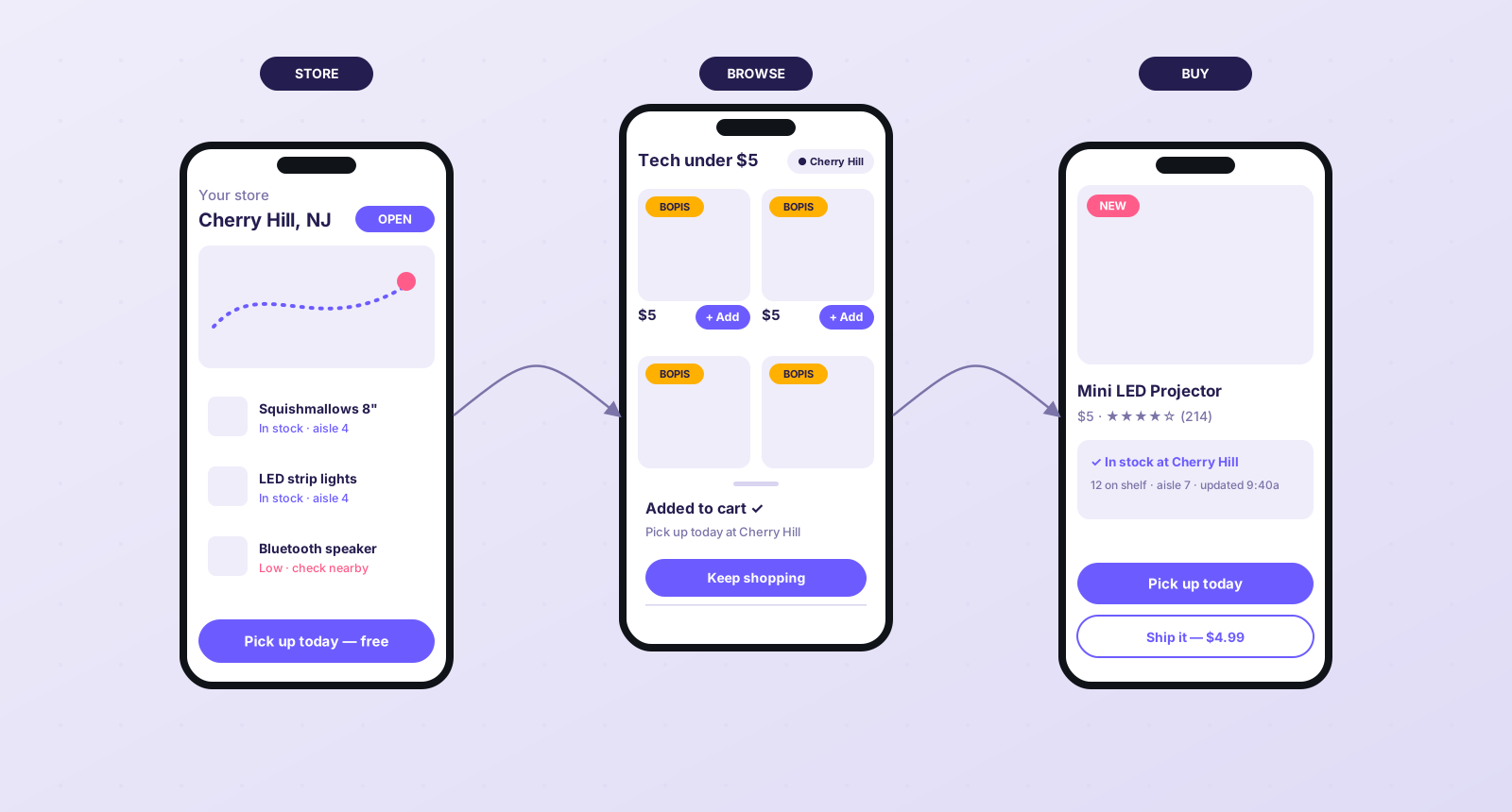
The store became a first-class feature
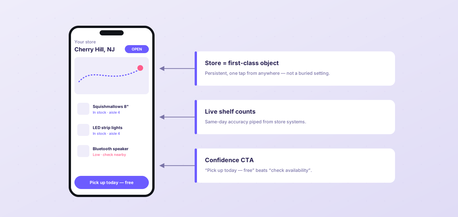
Store selector redesign with live inventory
Persistent store context, live shelf counts, and a confidence-first CTA — “Pick up today, free” beats “check availability”.

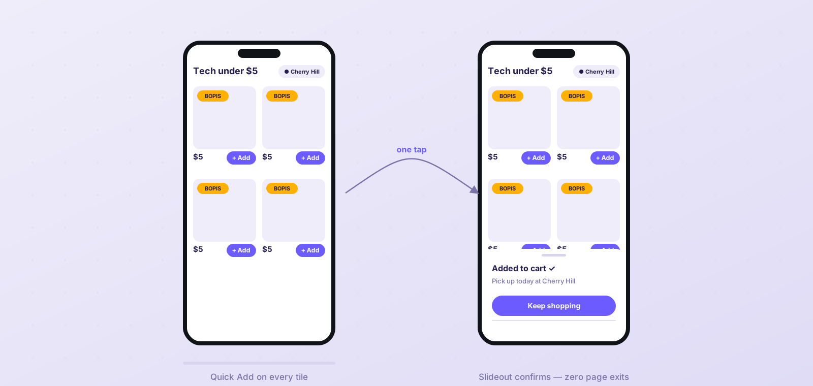
Quick Add, without leaving the shelf

PLP Quick Add slideout comparison
A slideout confirms the add and keeps customers in the grid — drop-off on impulse categories fell dramatically.

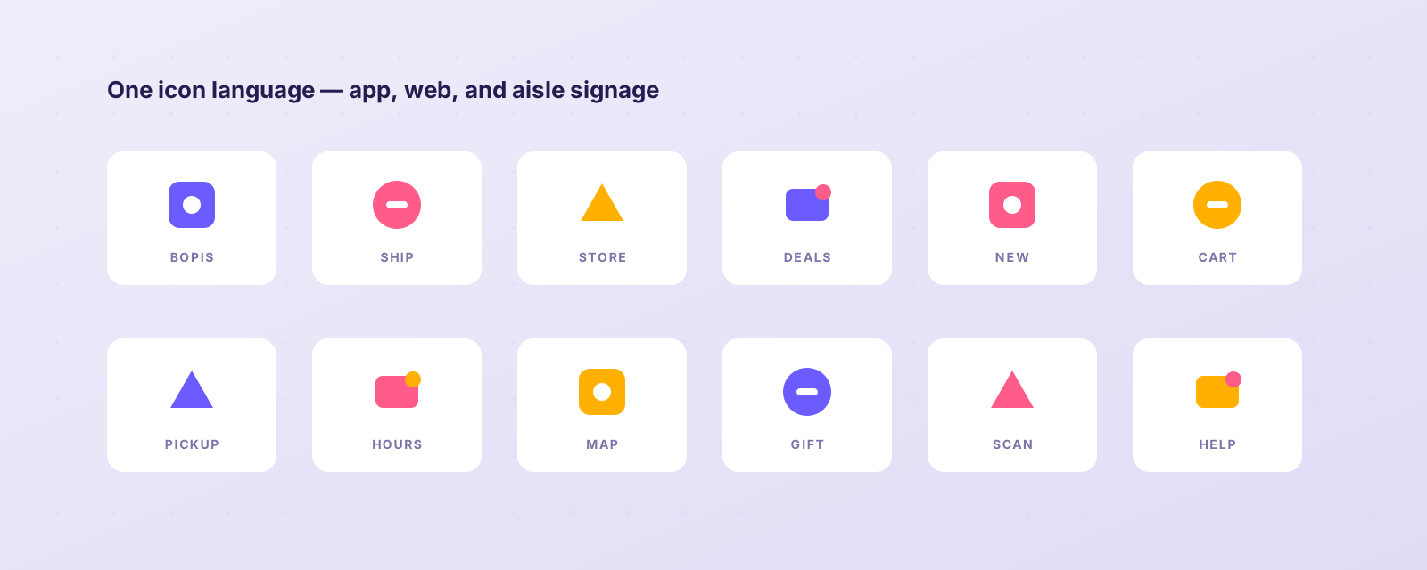
One icon language, from app to aisle

Custom OmniChannel icon system grid
A unified icon system aligned digital UI with physical signage — one visual vocabulary across every touchpoint.
04 — Impact

BOPIS turned from a detour into a driver.
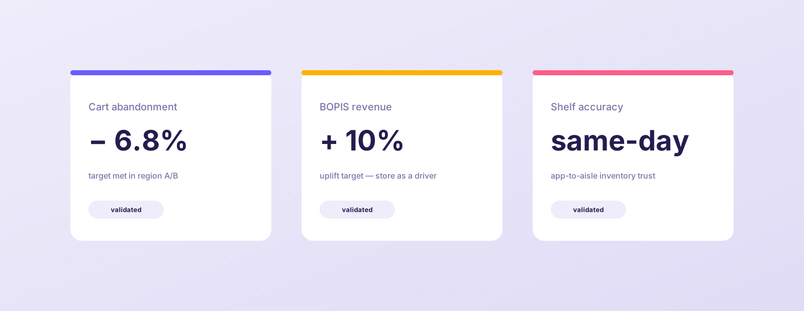
Cart abandonment BOPIS adoption ↑ toward +10%Inventory confidence same-dayBrand continuity app ⇄ aisle
OmniChannel results cards
Improvements were validated against live data before full rollout — completion climbed as trust signals removed uncertainty at the highest-friction moment.
05 — Process notes

How the work was de-risked

  1. Comparative sessions, old vs. new

    Every iteration ran head-to-head against the flow it replaced, measuring task completion, drop-off, and time-to-decision.

  2. Brick-and-mortar data as a design material

    Store inventory, associate picks, and pickup timing were treated as UI ingredients — not backend trivia.

  3. Validate live before rollout

    A/B exposure against real traffic confirmed the lift before the redesign shipped to every customer.