Nexon Checkout Redesign — hero overview mockups

Nexon Checkout Redesign

The flow was backwards — players picked payment before product. Fixing that cut purchase time by 76%.

Overview

During my initial interviews with Nexon, I pitched a redesign of a checkout that was cumbersome for new and returning users alike. Eighteen months later it was greenlit — and shipped to the Western region in Q4 2020.

Role

Product Designer

Client

Nexon America

Tools & Timeline

Figma · Axure · User Interviews — Q4 2020

01 — Context

Seven screens stood between a player and their game

Before proposing a single screen, I mapped the flow end-to-end and tracked every place users stalled, backtracked, or asked for help. The killer flaw: the checkout was backwards. Players had to choose how to pay before choosing what to buy — like picking Visa at Amazon's front door, then starting to shop.
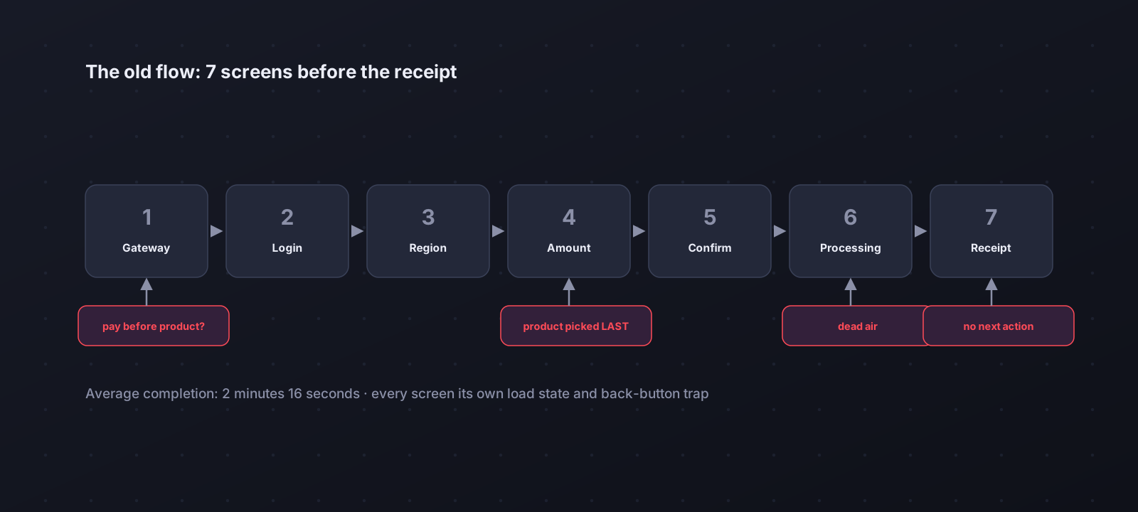
Nexon legacy checkout audit, seven screens with pain points
The audit: seven discrete screens, each with its own load state and back-button trap. Average completion — 2 minutes 16 seconds.
02 — The challenge

How might we get a returning player from “I want NX” back into the game in under a minute?

03 — The solution

Product first, payment second, receipt built in

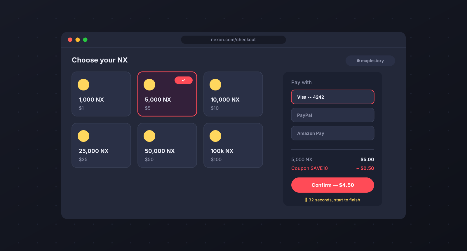
The redesign reordered the flow to match the mental model players already trust from every other store on the internet — and collapsed seven screens into three.

The flow, reordered
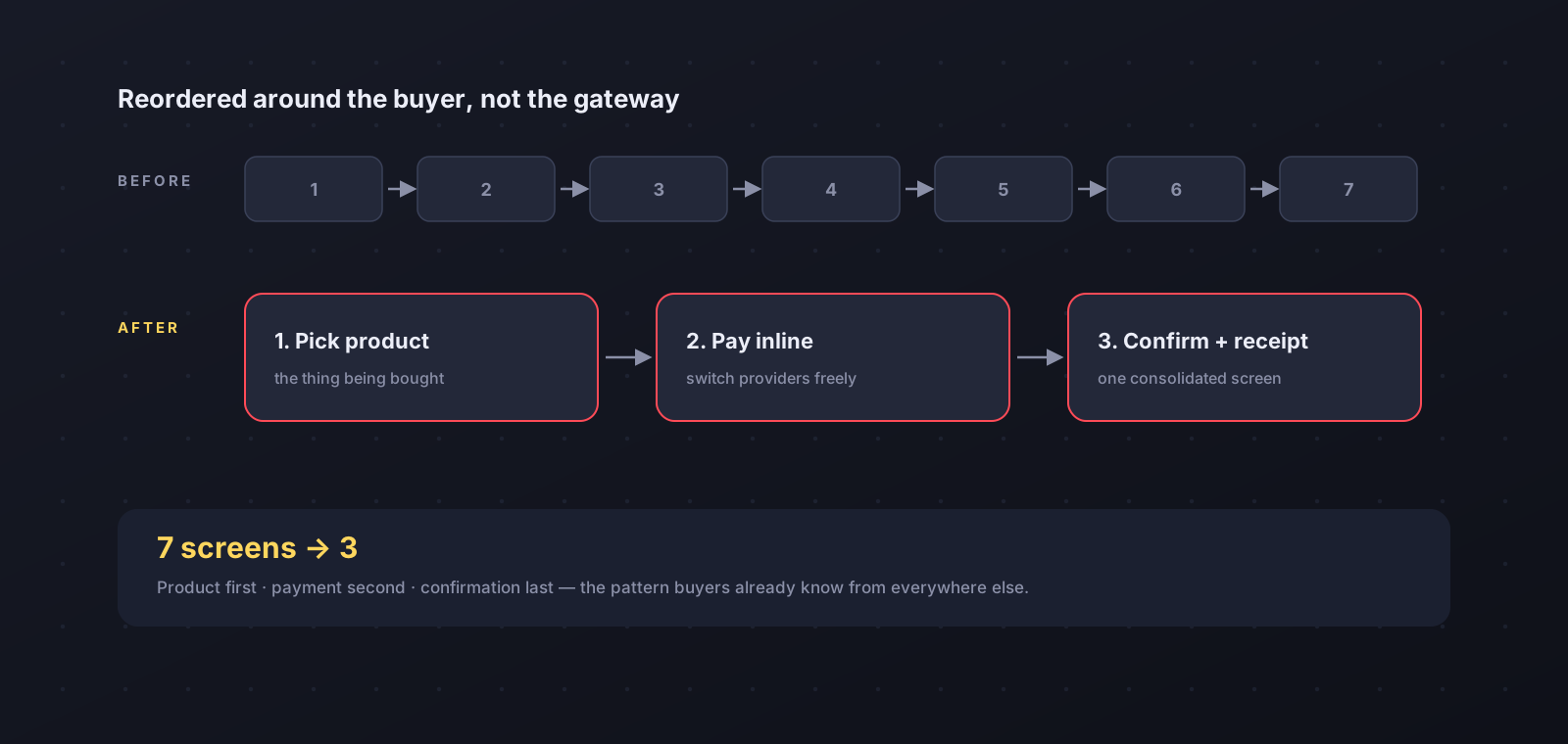
Seven screens reduced to three, flow comparison
Pick the NX bundle from a visual grid, pay inline (switching providers no longer resets the cart), confirm on one consolidated screen with the receipt baked in.

A fast lane for returning players

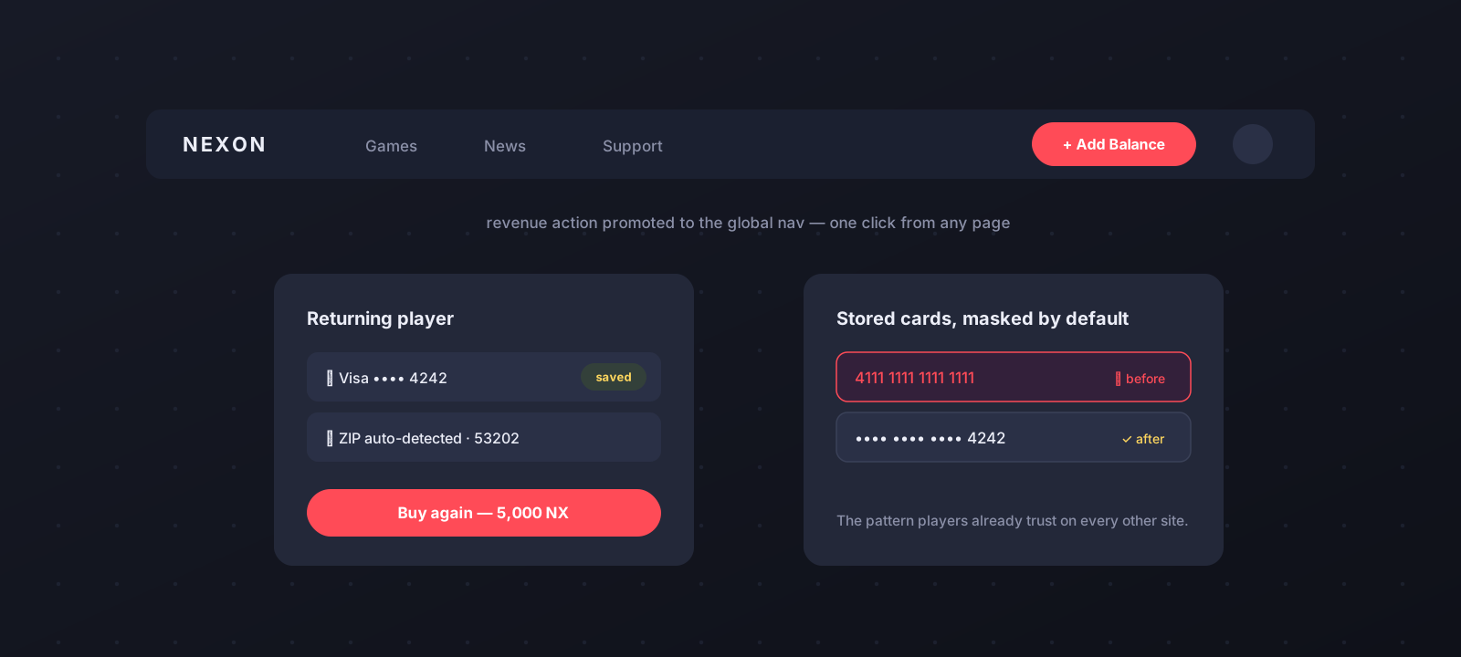
Returning player patterns: nav pill, saved payment, masked cards
An always-available “Add Balance” action in the global nav, auto-detected location and billing, and stored cards masked by default — the pattern players already trust.

Help and discounts moved into the flow
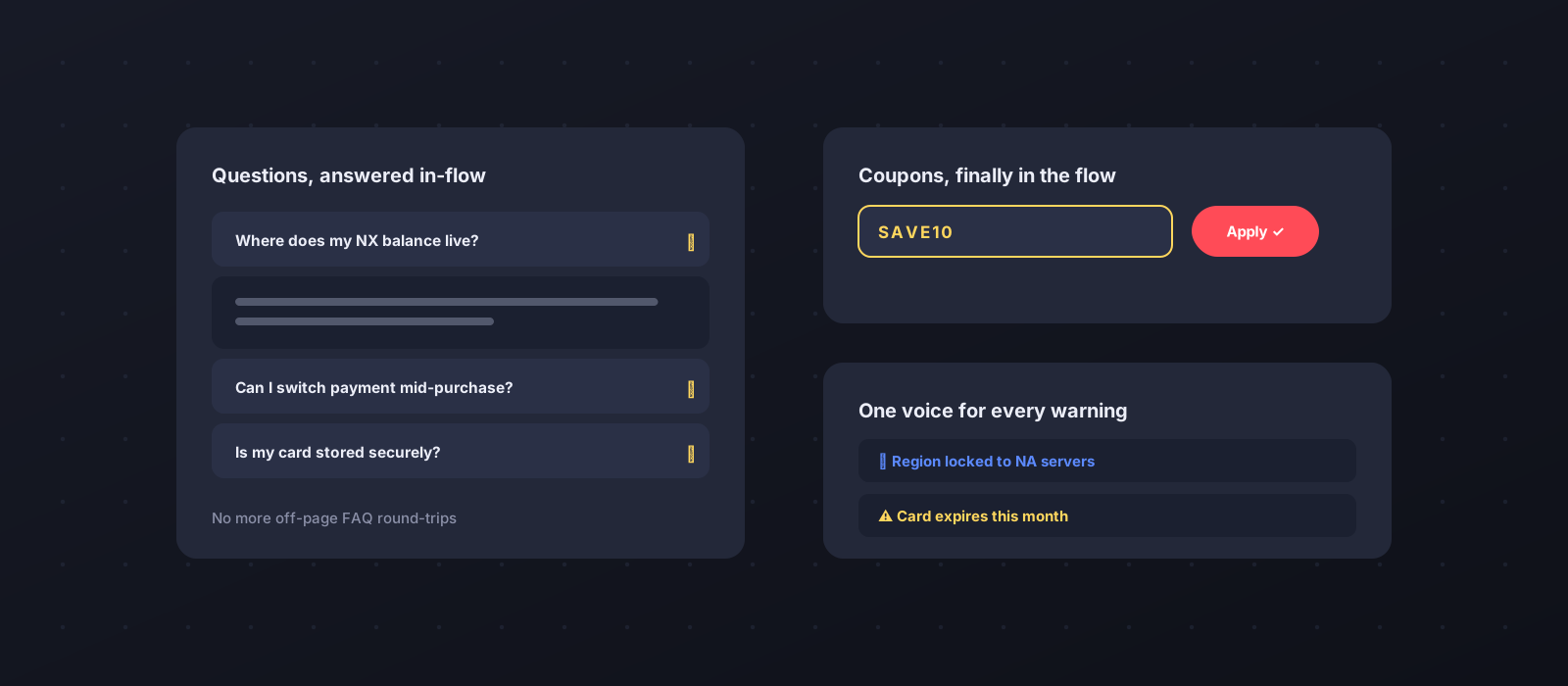
Inline FAQ, coupon entry and consistent messaging
Inline FAQ accordions replaced off-page help; coupons got a real field; warnings got one consistent voice.
04 — Impact

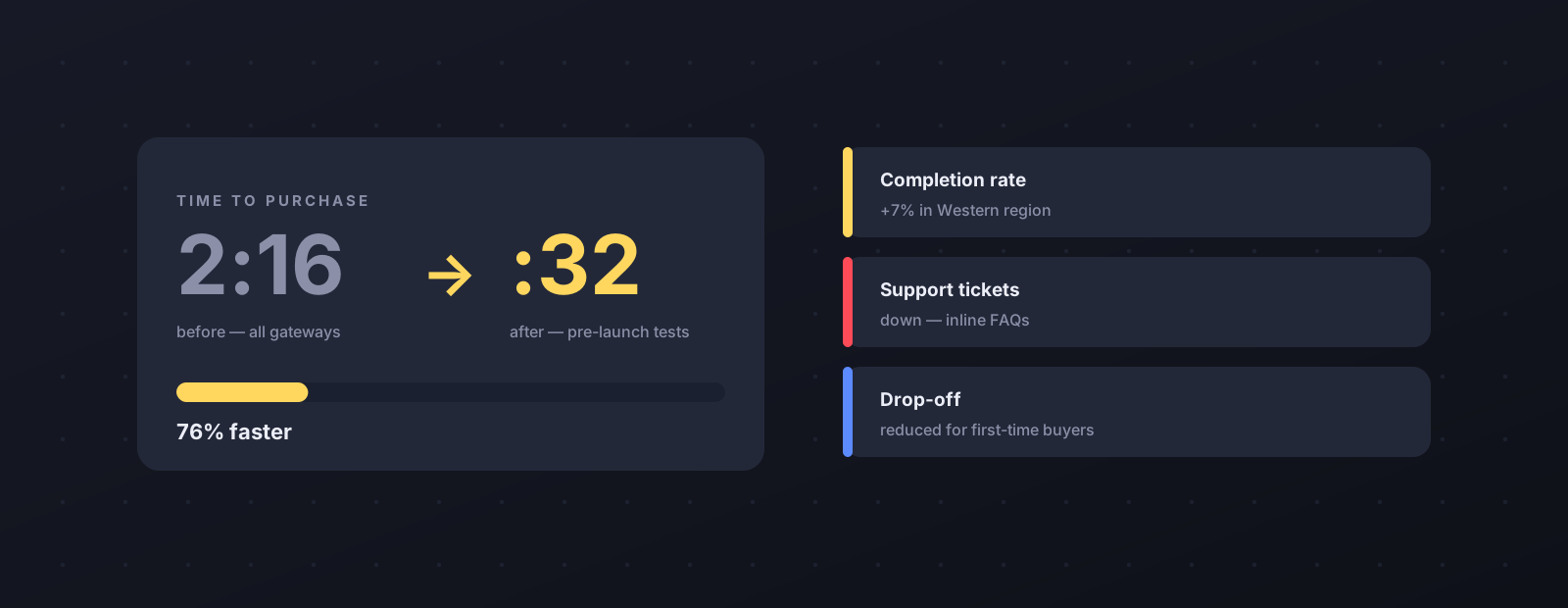
Checkout time fell from 2:16 to :32.

−76% time-to-purchase+7% completion (Western region)Support tickets First-time drop-off
Nexon results: 2:16 to 0:32 timer and metric cards
Measured across every payment gateway in pre-launch testing; completion climbed in lockstep after the Western-region launch.
05 — Process notes

How it got greenlit — and stayed honest

  1. Sell the problem before the pixels

    The redesign was pitched at hire, then re-pitched as a service proposal to Nexon America's senior management — greenlit with dedicated engineers.

  2. Audit with a stopwatch

    Every stall, backtrack, and support ticket in the legacy flow was catalogued and timed, turning “it feels slow” into “it costs 1:44 per purchase”.

  3. Test across every gateway

    Pre-launch testing covered each payment provider, so the :32 result held no matter how a player chose to pay.